

Colleges
- American Athletic
- Atlantic Coast
- Big 12
- Big East
- Big Ten
- Colonial
- Conference USA
- Independents (FBS)
- Junior College
- Mountain West
- Northeast
- Pac-12
- Patriot League
- Pioneer League
- Southeastern
- Sun Belt
- Army
- Charlotte
- East Carolina
- Florida Atlantic
- Memphis
- Navy
- North Texas
- Rice
- South Florida
- Temple
- Tulane
- Tulsa
- UAB
- UTSA
- Boston College
- California
- Clemson
- Duke
- Florida State
- Georgia Tech
- Louisville
- Miami (FL)
- North Carolina
- North Carolina State
- Pittsburgh
- Southern Methodist
- Stanford
- Syracuse
- Virginia
- Virginia Tech
- Wake Forest
- Arizona
- Arizona State
- Baylor
- Brigham Young
- Cincinnati
- Colorado
- Houston
- Iowa State
- Kansas
- Kansas State
- Oklahoma State
- TCU
- Texas Tech
- UCF
- Utah
- West Virginia
- Illinois
- Indiana
- Iowa
- Maryland
- Michigan
- Michigan State
- Minnesota
- Nebraska
- Northwestern
- Ohio State
- Oregon
- Penn State
- Purdue
- Rutgers
- UCLA
- USC
- Washington
- Wisconsin
High School
- Illinois HS Sports
- Indiana HS Sports
- Iowa HS Sports
- Kansas HS Sports
- Michigan HS Sports
- Minnesota HS Sports
- Missouri HS Sports
- Nebraska HS Sports
- Oklahoma HS Sports
- Texas HS Hoops
- Texas HS Sports
- Wisconsin HS Sports
- Cincinnati HS Sports
- Delaware
- Maryland HS Sports
- New Jersey HS Hoops
- New Jersey HS Sports
- NYC HS Hoops
- Ohio HS Sports
- Pennsylvania HS Sports
- Virginia HS Sports
- West Virginia HS Sports
ADVERTISEMENT
Install the app
How to install the app on iOS
Follow along with the video below to see how to install our site as a web app on your home screen.
Note: This feature may not be available in some browsers.
You are using an out of date browser. It may not display this or other websites correctly.
You should upgrade or use an alternative browser.
You should upgrade or use an alternative browser.
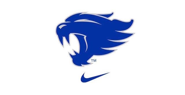
New UK helmet
- Thread starter screwduke
- Start date
not a fan of matte - I like shiny things - but I have trophy wife - so there's that

I would love to see us do a helmet with the new wildcat logo. Love the look though...purdeee
I would love to see us do a helmet with the new wildcat logo. Love the look though...purdeee
I agree. I love the new logo.
I like the power K and the interlocking UK. Not sold yet on the new logo and the second someone referenced two birds humping, I cannot unsee it with my brain
I really like this look!I like the power K and the interlocking UK. Not sold yet on the new logo and the second someone referenced two birds humping, I cannot unsee it with my brain
I don't care if the helmets are pink and purple polka dotted as long as they start to actually play SEC level football. Until then, it's just lipstick on a pig.
Bought my season tickets last week to cheer them on.
Bought my season tickets last week to cheer them on.
If there ain't a Power K on the side of that helmet, I'm gonna lose my sh!t.
There are three divisions on this board:
1) "I like it!"
2) "I don't care as long as we win!"
3) "WTF IS THIS?"
Number three can be further divided into subdivisions as follows:
a) "BRING BACK POWAH KAY!"
b) "Our colors are blue and white"
c) "Everything new sucks. I hate everything."
d) "Trololololololololololol."
I am option one in this instance.
BigBoyBlueMMA,
My wife is pretty big too, but I don't think she is trophy size.
My wife is pretty big too, but I don't think she is trophy size.
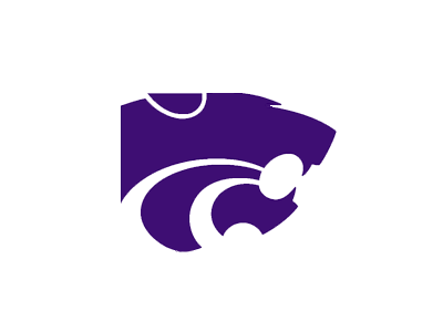
That logo is Kansas st. I want the let real wildcat!!
Uh no - it's not even close to the same other than they're both named Wildcats. While ours may look like two birds humping if you look at it a certain way, the K-State logo looks like a road going into a tunnel.
I don't care if the helmets are pink and purple polka dotted as long as they start to actually play SEC level football. Until then, it's just lipstick on a pig.
Bought my season tickets last week to cheer them on.
There's one of these every time.
While I agree, I can still comment on the logo without letting everyone know I'm super fan.
I'm not a big fan of matte finishes but what I do love is having all the options available.
Blue/white lettering
Blue/chrome lettering
Matte blue/white lettering
White/blue lettering
Matte white/blue lettering
White/chrome lettering
Chrome/blue logo
Chrome/blue lettering
matte black/blue logo
Gray/blue lettering
That's just the ones I can think of.
Blue/white lettering
Blue/chrome lettering
Matte blue/white lettering
White/blue lettering
Matte white/blue lettering
White/chrome lettering
Chrome/blue logo
Chrome/blue lettering
matte black/blue logo
Gray/blue lettering
That's just the ones I can think of.
While I could care less about how the helmets look, I do want the 4 and 5 star recruits to love them enough to come here and play.
Lol - trophies come in different sizes Bub - depends on your tasting pleasureBigBoyBlueMMA,
My wife is pretty big too, but I don't think she is trophy size.
![[cheers]](https://ct.yimg.com/mr/uploads/891/5628.gif "Cheers [cheers]")
Thanks for the message board etiquette advice Oprah.There's one of these every time.
While I agree, I can still comment on the logo without letting everyone know I'm super fan.
Last edited:
Nothing says pre season UK football excitement like a thread moderated by Oprah and edited by Akeelah!!!
Last edited:
Participation trophy?not a fan of matte - I like shiny things - but I have trophy wife - so there's that
This logo has grown on me. I think it would look bad a$$ on the side of a matte white helmetUh no - it's not even close to the same other than they're both named Wildcats. While ours may look like two birds humping if you look at it a certain way, the K-State logo looks like a road going into a tunnel.
I love the matte look. I am a big fan of all of our helmets except for the chrome one. Not a fan of the chrome look.
I'm fine with the matte blue.
I'm NOT fine with the bird humping logo.
Does sort of remind me of when we had the penis tongue issue. Sadly, that was my all-time favorite UK logo sans phallic resemblances.
So do trout.I like shiny things - but I have trophy wife - so there's that
Me have brain stem.I don't care if the helmets are pink and purple polka dotted as long as they start to actually play SEC level football. Until then, it's just lipstick on a pig.
Bought my season tickets last week to cheer them on.
There's one of these every time.
While I agree, .
Apparently there's two of them this time.
Did not like the new wildcat logo initially but it is Mid July and I am football ready so I bought this bad boy for my deck and I must say it is really sharp

Similar threads
- Replies
- 0
- Views
- 508
- Replies
- 125
- Views
- 5K
- Replies
- 34
- Views
- 2K
ADVERTISEMENT
ADVERTISEMENT