
Does anyone else think they suck? Don't even look like a wildcat !!!!!!!!!!!!!
Kinda looks like New Hampshire a little also??

Does anyone else think they suck? Don't even look like a wildcat !!!!!!!!!!!!!
The Kentucky Rorschachs
You're way off base with that Matt Jones comment. If anything he's spending too much time reading this board for material. More likely it made it to twitter after @WACB posted it here. Not sure if she made it, but she posted it here within 30 minutes of the unveil and Jones definitely never mentioned it on his show before that.
https://kentucky.forums.rivals.com/...tomorrow-shoes-too.160643/page-3#post-3592853

Vastly different. Of course there are similarities, their both wildcats, but I believe the designers did good job of making them different enough.
Vastly different. Of course there are similarities, their both wildcats, but I believe the designers did good job of making them different enough.
this has me laughing periodically the last two days. a very special bravo and kudosI wish the eyes were a little more pronounced but I like it. Something new to add to the wardrobe I guess.
My half-assed attempt to modify it to my liking. I assure you Nike will not be beating down my door any time soon.
![[roll]](http://l.yimg.com/j/assets/img/emoticons/classic/roll.r191677.gif "roll [roll]")
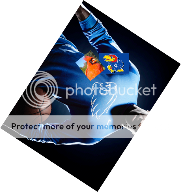
Yes, I think I was the first to notice the two birds, and I made this image you included here. But it's not proprietary information. Matt Jones can use it all he wants. I had a big smile and showed my wife when I saw it on the KSR website. Which leads me to my next point... why did you think I'm a girl?

The more I see it, the more I like it. It is normal to resist change but it is inevitable. Change or be left behind. Many NFL teams have updated their logos over the years and nearly everyone of them met a similar resistance. However, if you go back and look at and old Patriots or Broncos helmet today, they look so old they look funny. This logo will grow and will more than likely become the primary logo in a couple of years. 20 years from now they will replace it with an even newer one and most of you will hate to lose it.
I'll have to respectfully disagree. Way to cartoony and it just screams generic high school team.This was found in 10 seconds doing a Google search and it looks 10x better.

it screams i too have a penis tongue.I'll have to respectfully disagree. Way to cartoony and it just screams generic high school team.
Yours looks better actuallyMy half-assed attempt to modify it to my liking. I assure you Nike will not be beating down my door any time soon.
Well established in the internet.It's well established on the internet that it is a secondary logo


![[laughing]](http://l.yimg.com/j/assets/img/emoticons/classic/laugh.r191677.gif "Laughing [laughing]")