
Colleges
- American Athletic
- Atlantic Coast
- Big 12
- Big East
- Big Ten
- Colonial
- Conference USA
- Independents (FBS)
- Junior College
- Mountain West
- Northeast
- Pac-12
- Patriot League
- Pioneer League
- Southeastern
- Sun Belt
- Army
- Charlotte
- East Carolina
- Florida Atlantic
- Memphis
- Navy
- North Texas
- Rice
- South Florida
- Temple
- Tulane
- Tulsa
- UAB
- UTSA
- Boston College
- California
- Clemson
- Duke
- Florida State
- Georgia Tech
- Louisville
- Miami (FL)
- North Carolina
- North Carolina State
- Pittsburgh
- Southern Methodist
- Stanford
- Syracuse
- Virginia
- Virginia Tech
- Wake Forest
- Arizona
- Arizona State
- Baylor
- Brigham Young
- Cincinnati
- Colorado
- Houston
- Iowa State
- Kansas
- Kansas State
- Oklahoma State
- TCU
- Texas Tech
- UCF
- Utah
- West Virginia
- Illinois
- Indiana
- Iowa
- Maryland
- Michigan
- Michigan State
- Minnesota
- Nebraska
- Northwestern
- Ohio State
- Oregon
- Penn State
- Purdue
- Rutgers
- UCLA
- USC
- Washington
- Wisconsin
High Schools
- Illinois HS Sports
- Indiana HS Sports
- Iowa HS Sports
- Kansas HS Sports
- Michigan HS Sports
- Minnesota HS Sports
- Missouri HS Sports
- Nebraska HS Sports
- Oklahoma HS Sports
- Texas HS Hoops
- Texas HS Sports
- Wisconsin HS Sports
- Cincinnati HS Sports
- Delaware
- Maryland HS Sports
- New Jersey HS Hoops
- New Jersey HS Sports
- NYC HS Hoops
- Ohio HS Sports
- Pennsylvania HS Sports
- Virginia HS Sports
- West Virginia HS Sports
ADVERTISEMENT
You are using an out of date browser. It may not display this or other websites correctly.
You should upgrade or use an alternative browser.
You should upgrade or use an alternative browser.
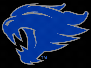
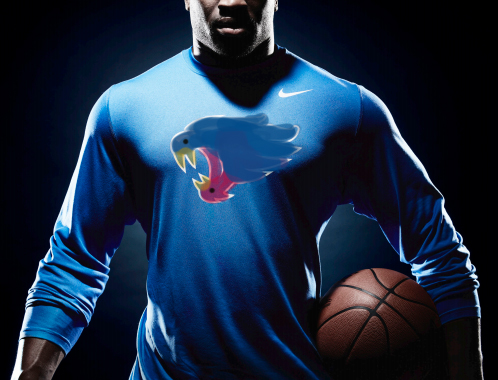
NEW LOGO
- Thread starter gonegone
- Start date

How much had they had to drink? LOLS!Jeez am I the only person on earth who loves it? Well actually this board is the only place I've really seen cats fans hating on it. I was out last night with a bunch of people and they all liked it.
Go Big Blue!
My question is this - who was unhappy with the old logos? Me thinks it was NIKE! They wanted to increase the sales of more UK stuff - since most Kentucky fans already have a wardrobe that includes 8 - 10 pieces or more of UK logo stuff! No one will recognize the new "wildcat" head as being Kentucky! The new logo is terrible and the wildcat is worse! Like I said a cross between K State and the Houston Cougars. It appears Nike and UK really like the Houston stuff - both logos are close to Houston's - problem is we are not and don't want to be Houston - but it must sell a lot stuff in Houston!Does anyone else think they suck? Don't even look like a wildcat !!!!!!!!!!!!!
Go Big Blue!
I am now starting to change my UK logo stuff to simply "Kentucky". When I wear a BLUE shirt with Kentucky on it - no one questions anything. Even the old UK logo got many comments - "are you from Kansas - lols!"Does anyone else think they suck? Don't even look like a wildcat !!!!!!!!!!!!!
Of course everyone realize's that many, many schools are no longer teaching kids to write? Now it is printing and using a keyboard only. No wonder we have so many liberal kids in our society. Once you leave Kentucky you will really see how the liberal teachings of this country are taking over. The democratic party, Nationally, is so socialistic now - it was written about many years ago and we were warned about it. When more people live off of the government than pay into the government the country will begin to die. We are still the greatest country in the world - but for how much longer? Seriously!! Rubio is correct - Obama knows exactly what he is doing. Read his book about his father's dream - he is trying hard to make America HIS father's dream.
At first I hated it. But it is growing on me for whatever reason. I've had non UK friends tell me they love it.
I actually am starting to like both of the new logos. The UK is a minor change and I don't have an opinion one way or the other (except that it is unreal that they spent $80k on it) and the new wildcat is fresh. The only complaint I have is the 2 birds banging thing, but then I looked at some of the other schools and you could make that same comment about Houston's and Chicago St wildcats as well if you look really hard. People see what they want. If you hate it I am sure we will get a new one in another 30 years anyways.
Man, I'm genuinely not a negative guy or anything, but that new logo is awful. I'm not a fan of the new UK at all, but that "Wildcat" makes it look like a masterpiece.
Also, the only reason I think some of our fans are defending it is solely because Nike made it. If Adidas made something like that, everyone would be ripping it to shreds.
In my eyes, UK should've went with the Wildcat and Power K below for this redesign. Both are timeless. They would've worked just as well twenty years ago or twenty years from now, whereas this new logo will become dated very quickly.
All in all, I think it was just a swing and a miss from Barnhart and Co.; a lot like most of his coaching hires.
Pretty true.its why I like putting people in our positions that understand what Kentucky is. Barnhart is far from it, that's why his ideas always suck. I can accept the new logo as a small secondary thing, but the power K and jump out wildcat will forever be Kentucky. This new logo won't last too long, it's just something new to do.
I'm not a huge fan, but just like the warmup music, I don't have to be. From what I understand, this alt logo is intended for the kids not the fans.
As long as the kids are happy with it, I'm happy with it.
As long as the kids are happy with it, I'm happy with it.
I think OHcatfans avatar should've been the new logo. But agreed that the new one is a lazy design by Nike

the one thing about penis-tongued wildcat is non fans didn't really notice. cuz once i noticed it i couldn't wear the gear anymore. it was right about that time where it changed to sword-tongued wildcat. around '95.Lol, that was horrible, just got my jacket with that logo on the back that I had wanted forever and seemed like a month later that came out.....
I wish the eyes were a little more pronounced but I like it. Something new to add to the wardrobe I guess.

I think it's kinda cool. I do see the mating birds when you turn it sideways. Although I think that just makes me like it more.Jeez am I the only person on earth who loves it? Well actually this board is the only place I've really seen cats fans hating on it. I was out last night with a bunch of people and they all liked it.
![[roll]](http://l.yimg.com/j/assets/img/emoticons/classic/roll.r191677.gif "roll [roll]")
I don't think I hate it, but I don't want to buy anything with that logo either. It looks very... Arena Football League. Or something like that. If it stays as a secondary logo to our UK it won't bother me though.
I do like the new Wildcat logo even though it looks similar to Northern Iowa's logo. Hate the new UK logo however...
Cyber Cat. The Bronco's went through this in the 90's. They switched the still original image of the Bronco to the one they have now. People called it Cyber Horse. It was met with mixed reviews like this one. Now that's been like 20 years ago, and the old one is called retro.
Not a fan of the new UK logo but have to say I do like the new Wildcat a lot. And, I'm no youngster at all so that's not it. Didn't like the orange/tan/gold or whatever the old Wildcat was as that color just never looked goo to me. The new one looks modern, aggressive, fierce and I think it doesn't look like K-State's at all. Also, for the bird fans out there, what the heck? Listening to Matt Jones too much, I think, as that's what he was saying yesterday. I guess anyone can see what they want but to have to turn a logo sideways to come up with some image, well, more power to those people is all I can say. Can't wait to get new gear with that Wildcat on it.
I didn't really care for the logo until I saw these sweet helmets. Thanks for posting themPrepare to see it more prominently in football.

Not a fan of the new UK logo but have to say I do like the new Wildcat a lot. And, I'm no youngster at all so that's not it. Didn't like the orange/tan/gold or whatever the old Wildcat was as that color just never looked goo to me. The new one looks modern, aggressive, fierce and I think it doesn't look like K-State's at all. Also, for the bird fans out there, what the heck? Listening to Matt Jones too much, I think, as that's what he was saying yesterday. I guess anyone can see what they want but to have to turn a logo sideways to come up with some image, well, more power to those people is all I can say. Can't wait to get new gear with that Wildcat on it.
You're way off base with that Matt Jones comment. If anything he's spending too much time reading this board for material. More likely it made it to twitter after @WACB posted it here. Not sure if she made it, but she posted it here within 30 minutes of the unveil and Jones definitely never mentioned it on his show before that.
https://kentucky.forums.rivals.com/...tomorrow-shoes-too.160643/page-3#post-3592853
Last edited:
it's even worse/more noticable now, you don't even have to turn it to see after @Officer Barbrady posted the deep, sensual penetration gif
I think a lot of folks just love to complain and the Internet is a great outlet for that. The new wildcat is gnarly. I think the people that say They hate it would automatically hate anything outside of the old school power K (which I also love). People are just contrary.
There is no accounting for different taste...but this is awful on every front. First the letters are boring and narrow. Second the wildcat has some sort of gait problem, maybe pigeon toed. Next, for people who complain about things, orange or brown is awful with our colors. Finally, it's not iconic and is way too busy. It is nascaresque in every way.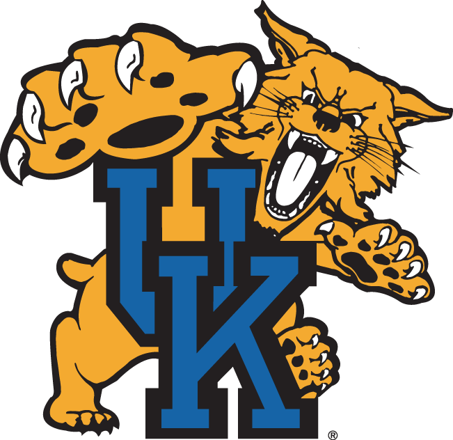
This is still my favorite logo.
I like the new one, but I prefer any logo we have had from any period in time over this one. It is the definition of bad logo work.
There is no accounting for different taste...but this is awful on every front. First the letters are boring and narrow. Second the wildcat has some sort of gait problem, maybe pigeon toed. Next, for people who complain about things, orange or brown is awful with our colors. Finally, it's not iconic and is way too busy. It is nascaresque in every way.
I like the new one, but I prefer any logo we have had from any period in time over this one. It is the definition of bad logo work.
Everyone's taste are different, but at least the 'K' doesn't look like an 'H' and the wildcat doesn't look like a Boo Diddley from super Mario

I do prefer the logo I posted previously, but do like the version with the wildcat in grey better than brown, but couldn't find a quick image of that.
The new wildcat isn't horrible, the new K is...
Freaking hate that POS cat and new Uk Logo. I'll never buy one thing with either on it. I'm praying it catches enough heat that it gets banned like the dick tongue. Barnhart is a damn moron. Literally everything he does turns to crap. He's is a horrible AD.
I absolutely can't wait for Peevy to become our AD. He seems very good at his job and knows what he's doing.
UK probably spent thousands and thousands for the new UK design and cat when they could have google searched better alternative UK logos. It's ridiculous.
I absolutely can't wait for Peevy to become our AD. He seems very good at his job and knows what he's doing.
UK probably spent thousands and thousands for the new UK design and cat when they could have google searched better alternative UK logos. It's ridiculous.
I totally agree, Since we read from left to right, it's easier on the eyes

It is intended to be viewed from left to right on your radio dial.
Similar threads
- Replies
- 30
- Views
- 2K
- Replies
- 31
- Views
- 2K
- Replies
- 29
- Views
- 2K
- Replies
- 72
- Views
- 5K
ADVERTISEMENT
Latest posts
-

-

-
Pretty Decent Week So Far For Our NCAA/SEC Seeding
- Latest: ImTheVillageIdiot
-
 Like him or not, Todd Golden is a very good coach
- Latest: michaeluk26
ADVERTISEMENT