ADVERTISEMENT

Bring back the Power K

There is one UK. I think the current look is solid and cannot believe UK fans care so much about something they call the "power K." That just sounds funny to me.

And, I feel this is the kind of thread that exists for schools that have very little success on the field. Let's complain about the unis and the logo.
 
I'll take the Power K over the new UK logo any day...
new%20uk%20logo_zpslkg2e5ee.jpg
GO U H!~
 
Anything but that new logo they are going to use in the center of the field, that thing is hideous.
Some of you have completely lost your mind. I get that you liked the last logo better, but the new one is so nearly identical to that one that to fuss about it is laughable. I can see wanting the power K, the logo to be bigger, etc, but to say that it's so much worse compared to what we had doesn't make a lot of sense.
 
part of the problem is UK is stuck in the middle with Kentucky football and style/marketing. We now have a new lame interlocking logo that looks like the K is an H (no need to change that). Either go old school and get the power K and make it retro, or step up and get something new. UK was about 7 years behind on the uniform updates and different combos UK could have been ahead of the other SEC schools. UK has a chance with the stadium renovations to update things but nothing is indicating that just yet.

Really? The renovations are light years ahead of what we had. And the recruiting room and patio overlooking the field in the student section is completely awesome. I suggest you go thenewcws.com and look at the before and after images and the live construction camera before making silly comments like the one you did above.
 
The only thing worse than the new UK logo is that stupid old block K logo. It's ugly and old and should never be brought back and it won't be because of all the money and marketing put into the interlocking logo. Aside from the once in a blue moon block logo tshirt, we won't see it again.
 
The only thing worse than the new UK logo is that stupid old block K logo. It's ugly and old and should never be brought back and it won't be because of all the money and marketing put into the interlocking logo. Aside from the once in a blue moon block logo tshirt, we won't see it again.

It's surprising that so much money was put into the interlocking logo given how popular that was in the past among a lot of schools. Oregon had an interlocking logo, Mississippi State had an interlocking logo, Tennessee had an interlocking logo, South Carolina did, Baylor still has one, Houston does, Oklahoma does, Southern Cal does and that's just the ones I can think of off the top of my head.
 
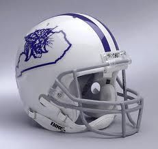
Block K on helmets and for the midfield logo using the old school wildcat head on the earlier helmet would be my preference.
 
ADVERTISEMENT
ADVERTISEMENT