And Mitch hits a one-outer on the river to take them all.<<<<<moves chips all in on power k
Colleges
- American Athletic
- Atlantic Coast
- Big 12
- Big East
- Big Ten
- Colonial
- Conference USA
- Independents (FBS)
- Junior College
- Mountain West
- Northeast
- Pac-12
- Patriot League
- Pioneer League
- Southeastern
- Sun Belt
- Army
- Charlotte
- East Carolina
- Florida Atlantic
- Memphis
- Navy
- North Texas
- Rice
- South Florida
- Temple
- Tulane
- Tulsa
- UAB
- UTSA
- Boston College
- California
- Clemson
- Duke
- Florida State
- Georgia Tech
- Louisville
- Miami (FL)
- North Carolina
- North Carolina State
- Pittsburgh
- Southern Methodist
- Stanford
- Syracuse
- Virginia
- Virginia Tech
- Wake Forest
- Arizona
- Arizona State
- Baylor
- Brigham Young
- Cincinnati
- Colorado
- Houston
- Iowa State
- Kansas
- Kansas State
- Oklahoma State
- TCU
- Texas Tech
- UCF
- Utah
- West Virginia
- Illinois
- Indiana
- Iowa
- Maryland
- Michigan
- Michigan State
- Minnesota
- Nebraska
- Northwestern
- Ohio State
- Oregon
- Penn State
- Purdue
- Rutgers
- UCLA
- USC
- Washington
- Wisconsin
High Schools
- Illinois HS Sports
- Indiana HS Sports
- Iowa HS Sports
- Kansas HS Sports
- Michigan HS Sports
- Minnesota HS Sports
- Missouri HS Sports
- Nebraska HS Sports
- Oklahoma HS Sports
- Texas HS Hoops
- Texas HS Sports
- Wisconsin HS Sports
- Cincinnati HS Sports
- Delaware
- Maryland HS Sports
- New Jersey HS Hoops
- New Jersey HS Sports
- NYC HS Hoops
- Ohio HS Sports
- Pennsylvania HS Sports
- Virginia HS Sports
- West Virginia HS Sports
ADVERTISEMENT
You are using an out of date browser. It may not display this or other websites correctly.
You should upgrade or use an alternative browser.
You should upgrade or use an alternative browser.
Bring back the Power K
- Thread starter CB3UK
- Start date
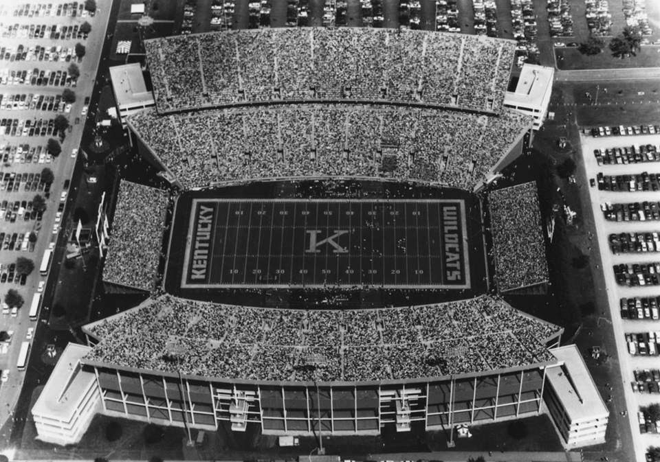
Yes and Yes... I dig the ArtDeco typeface. Super dope.Love the font used in this pic. Also, probably in the minority, but I like having KENTUCKY in both EZs instead of WILDCATS.

Bring back the Curry K, sharp looking.
I say screw the Power K, the interlocking UK, and get innovative and put hashtag for something like "#BBN" on the helmet instead.
Seriously....to me, the Power K means losing football, the same as the interlocking UK. I dont get why so many are pining for it. It's not like it reminds anyone of some glory days gone by for Kentucky football. Maybe we can bring back two bits and the UKMB pregame spelling bee, too.
Seriously....to me, the Power K means losing football, the same as the interlocking UK. I dont get why so many are pining for it. It's not like it reminds anyone of some glory days gone by for Kentucky football. Maybe we can bring back two bits and the UKMB pregame spelling bee, too.
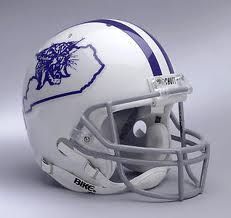
I don't understand the concept of putting a map on a helmet. That is so 60s/70s. The only FBS team (out of 127 I think) to do so last year was powerhouse Old Dominion. Even those yokels at IU don't do it.
You've earned 10 bonus points for being able to work in a "slam" against IU...well played!
also interesting how they use both upper and lower case lettering. for reference please see the "n" in KEnTUCKYYes and Yes... I dig the ArtDeco typeface. Super dope.
part of the problem is UK is stuck in the middle with Kentucky football and style/marketing. We now have a new lame interlocking logo that looks like the K is an H (no need to change that). Either go old school and get the power K and make it retro, or step up and get something new. UK was about 7 years behind on the uniform updates and different combos UK could have been ahead of the other SEC schools. UK has a chance with the stadium renovations to update things but nothing is indicating that just yet.
The interlocking UK is on every UK athletics uniform, not just football.part of the problem is UK is stuck in the middle with Kentucky football and style/marketing. We now have a new lame interlocking logo that looks like the K is an H (no need to change that). Either go old school and get the power K and make it retro, or step up and get something new. UK was about 7 years behind on the uniform updates and different combos UK could have been ahead of the other SEC schools. UK has a chance with the stadium renovations to update things but nothing is indicating that just yet.
The Power K is awesome.
I am a proponent of the cat head in the outline of the state as well.
Either way as fine. They can wear fluorescent blue with matte black, as long as they win
I am a proponent of the cat head in the outline of the state as well.
Either way as fine. They can wear fluorescent blue with matte black, as long as they win
Not all fans share your opinion... I like the interlocking UK football helmet... Something like the one on your avatar.....Title says it all. WTH do we have to do as a fan base to get the administration to hear us? Bring back the Power K!

Can I go back and edit my OP to add a poll to this thread? I'm on my phone, I assume the mobile version looks different than the desktop.
I can honestly say this is one subject that I could care less about. Which one they use is fine with me.
Agreed. It's not like we were more successful with one so we are trying to resurrect the glory days or something. Both look good. Both have been used by the unversity for about a 20 yr span. Either way is fine with me.
One positive thing about using the Power K is, perhaps the media will quit referring to the Cats as KU as in Kansas. I would like a nickel for each time I have heard some uniformed person refer to Kentucky as KU. It is irritating. The power K is bold and more prominent on a helmet than the little UK that we use.
Huh? Yes, I've heard a few refer to UK as KU...and I'm sure that KU sometimes gets called UK but NEVER has UK been refered to as "K".One positive thing about using the Power K is, perhaps the media will quit referring to the Cats as KU as in Kansas. I would like a nickel for each time I have heard some uniformed person refer to Kentucky as KU. It is irritating. The power K is bold and more prominent on a helmet than the little UK that we use.
Add the fact...if they are "uninformed" then why do you think they would recognize a new distinction?
UK has been "UK" or "Kentucky" for-ev-er regardless of what logo was used.
I've never heard of Tennessee referred to as T, Georgia referred to a G, or Arizona referred to as A. It's UT, UGA, and UA. All have single letters on their helmets because it is a bold, sharp logo that stands out. Like those three, we are not just the University of Kentucky, Tennessee, Georgia, or Arizona. We are the flagship program in this Commonwealth. We Are KENTUCKY and the K would say that. There is nothing wrong with the Power K being exclusive just for football. It was for 25 years. Sure, our tradition may not be sparkling and shiny, but it's a sharp look and most love it.
UK has had a variety of good looking helmets I think. None of them look bad. But when people talk about the best looking helmets,they always think of the traditional powers as having the best. Alabama and Ohio St.have some boring helmets really,but their fans worship them as they are a symbol of their dominance in the sport .Who can imagine Georgia or LSU changing those head gears? Color me old fashioned, but I love the tradition rich look of those same ole helmets. Takes me back to my childhood with Keith Jackson and co.calling college football games on the old TV broadcast.
I like the Power K as well and keep looking for one with a blue K and white background for my new white SUV.I like the UK logo. It may get confused with United Kingdom but not Kent State.
True story. When going to a reunion a few years ago we were all told to use the Embassy Suites on Newton Pike to get our UK discount.
A British sounding lady answered and and when I asked for the UK discount she asked me to hold. Came back to the phone and said "I have asked and we do not give a United Kingdom discount." I of course suggested she ask the supervisor about the University Of Kentucky discount and all was solved.
Bring back the Power K.
Lou
I like the Power K as well and keep looking for one with a blue K and white background for my new white SUV.
True story. When going to a reunion a few years ago we were all told to use the Embassy Suites on Newton Pike to get our UK discount.
A British sounding lady answered and and when I asked for the UK discount she asked me to hold. Came back to the phone and said "I have asked and we do not give a United Kingdom discount." I of course suggested she ask the supervisor about the University Of Kentucky discount and all was solved.
Bring back the Power K.
Lou
LOL Cool story but heh old women have their own world anyway.
Those were great looking uniforms. I like that shade of blue much better than todays Smurf colored blue.
This ^^^^^^^ I like the Power K much better than the UK at center field.
We can wish all we want but the fact is nike has a contract with UK and that is there logo for kentucky. For us to go back to the power K we would have to drop nike.
One of the reasons no one takes UK football seriously is because we don't take it seriously. I've been a UK football fan growing up in Tennessee my whole life. We've never taken it seriously since I've been alive, 1985.
I say this because it's relevant to the uniform conversation. We are too f'ing gimmicky. Alabama, LSU, Georiga etc will NEVER allow Nike or anyone to change their tradition and their image. Take the damn stripes down the pants, put the power K on the helmet, and go with a more traditional uniform. It looks best, and we need to start looking like a champion to maybe one day be one. Right now we resemble an old blue Big East West Virginia type team than anything else. I don't care how many 17 yr old bottom feeder 3 stars from Florida like the gimmicky crap.
Just my opinion.
Last edited:
Throwback Unis should be used with the Power K when we kick the SH&T out of UofSmell !
If anyone can tell me ASIDE from being louisville that their uniforms aren't better than ours in that pic and I'll just smdh. The white uniforms with the full stripes down the pants and helmet it so much better and to me its not even close. Our 07 football (basketball) uniforms were absolutely pathetic. We've got to stop this madness. Why do we allow Nike to screw our image up? No one that takes football seriously in the SEC allows it.
I've Googled on UK stuff many a time only to get United Kingdom crap... The logo we have shows a lack of creativity and has since it was initiated...And the recent "new & improved" logo will go unnoticed by 99.9% of fans and 100% of those not .... Does it bother me?... No!... But if a person asks someone, who they for??? They'll most often say "Kentucky" and far less often "UK"... And I think this runs true in most places but I haven't done a study... What we forget sometimes is that these decisions are made by people the University employs that weren't from around these parts.... They are fans of Kentucky" because the check they get on Friday makes it so............ And I'm talking about you Barnfart.
Another reason why I wish we were just "K". I
It's undeniable. This is what SEC champions look like.
Similar threads
- Replies
- 32
- Views
- 3K
- Replies
- 38
- Views
- 4K
- Replies
- 13
- Views
- 1K
- Replies
- 85
- Views
- 7K
ADVERTISEMENT
ADVERTISEMENT


