
Getting close fellas. Here is what a few places looked like today.
New graphics in the locker room


Testing the boards out

Graphics on the West end zone entrance to the locker room.


Starting the concourse paving


Loft Club


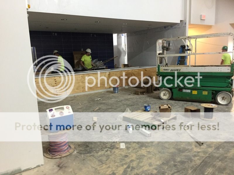
Field Level Club


New graphics in the locker room
Testing the boards out
Graphics on the West end zone entrance to the locker room.
Starting the concourse paving
Loft Club
Field Level Club

