It's lame as hell and pure bad memories and MOJO.
Thank you.
Thank you.


Follow along with the video below to see how to install our site as a web app on your home screen.
Note: This feature may not be available in some browsers.
This. Go back to the original UK logo too while we’re at it.It's lame as hell and pure bad memories and MOJO.
Thank you.
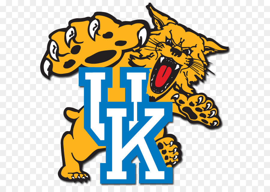
Please! I want d*ck tongue cat back!It's lame as hell and pure bad memories and MOJO.
Thank you.
Not happening, but arguable that it should.Not happening.
You shut your trash mouth. Best logo in sportsIt's lame as hell and pure bad memories and MOJO.
Thank you.
All these logos look the same. It's fine. Oh its a cat facing to the left. I want to be unique. A wildcat facing forward instead. Like Arizona.Looks too much like Kansas State’s logo. That’s what we all need in a logo—-to instantly have flashblacks to 2018 and 2023. 😞
Same here, I hate that bird logo and won't ever buy any gear that has it on it.I’m on board with this. Don’t own any screwing birds apparel now or ever plan too, just awful!!!!!
Turn the current Wildcat they put on shirts slightly and you can't get it out of your head after seeing it. Generic too, just like everything Nike does.Screwing birds? Which one is that?
I wanna see the 1994 apex uniforms.What we need more of is alternate uniforms. Last two years we wore from time to time the 93 Final Four year uniforms. Would love Pope to bring back the 95 icicle and denim a few game a year.
That could be modernized to look good in 2024. Louisville updated their dunking card and heisman card to make them look modern, yet still have the retro flair.This is the one everyone wants
YES !This is the one everyone wants
Which one? Personally (and this is probably just generational bias) I like the roaring Wildcat from the 90s/early 00s best! I would be so pleased as punch if they brought that back as our current logo is too generic.This. Go back to the original UK logo too while we’re at it.