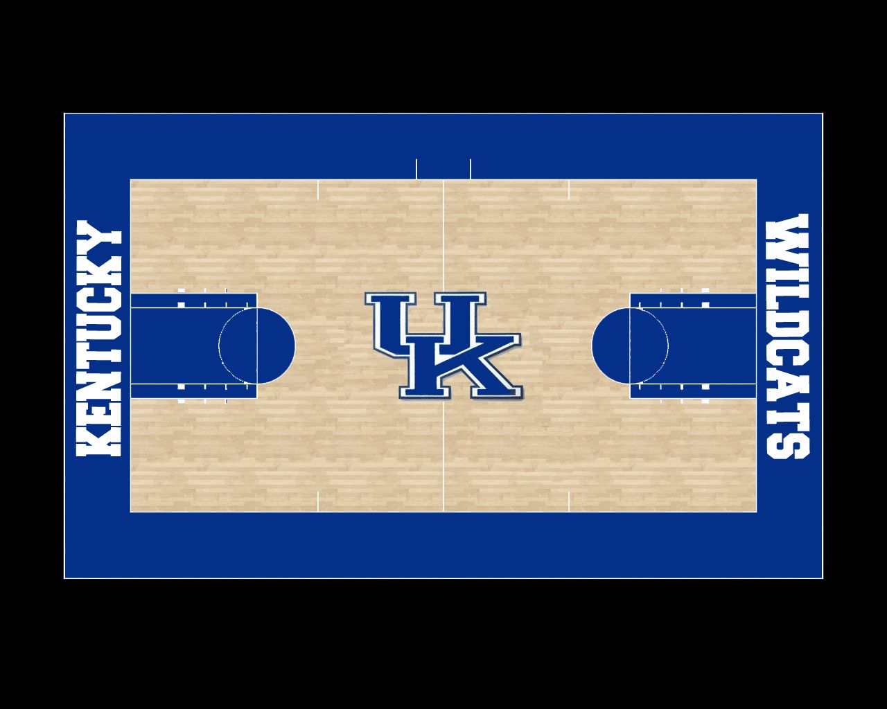
Since the new court had to be sent back, I think this gives UK an opportunity to come up with a better design. Looking around the nation, there are a ton of schools that have the state outline at center court. In our own conference alone I can think of Arkansas, Missouri, and Mississippi State and I’m sure there are more. It used to be somewhat unique, now it’s getting really generic; particularly the darker colored wood look versus a colored state like UNC and Indiana have. One thing UK basketball should never be is generic. So my question is what would YOU prefer at center court? Personally I’d like the UK logo from the 90’s with the snarling Wildcat.


Colleges
- AAC
- ACC
- Big 12
- Big East
- Big Ten
- Pac-12
- SEC
- Atlantic 10
- Conference USA
- Independents
- Junior College
- Mountain West
- Sun Belt
- MAC
- More
- Navy
- UAB
- Tulsa
- UTSA
- Charlotte
- Florida Atlantic
- Temple
- Rice
- East Carolina
- USF
- SMU
- North Texas
- Tulane
- Memphis
- Miami
- Louisville
- Virginia
- Syracuse
- Wake Forest
- Duke
- Boston College
- Virginia Tech
- Georgia Tech
- Pittsburgh
- North Carolina
- North Carolina State
- Clemson
- Florida State
- Cincinnati
- BYU
- Houston
- Iowa State
- Kansas State
- Kansas
- Texas
- Oklahoma State
- TCU
- Texas Tech
- Baylor
- Oklahoma
- UCF
- West Virginia
- Wisconsin
- Penn State
- Ohio State
- Purdue
- Minnesota
- Iowa
- Nebraska
- Illinois
- Indiana
- Rutgers
- Michigan State
- Maryland
- Michigan
- Northwestern
- Arizona State
- Oregon State
- UCLA
- Colorado
- Stanford
- Oregon
- Arizona
- California
- Washington
- USC
- Utah
- Washington State
- Texas A&M
- Auburn
- Mississippi State
- Kentucky
- South Carolina
- Arkansas
- Florida
- Missouri
- Ole Miss
- Alabama
- LSU
- Georgia
- Vanderbilt
- Tennessee
- Louisiana Tech
- New Mexico State
- Middle Tennessee
- Western Kentucky
- UTEP
- Florida International University
High School
- West
- Midwest
- Northeast
- Southeast
- Other
- Alaska
- Arizona
- California
- Colorado
- Nevada
- New Mexico
- Northern California
- Oregon
- Southern California Preps
- Washington
- Edgy Tim
- Indiana
- Kansas
- Nebraska
- Iowa
- Michigan
- Minnesota
- Missouri
- Oklahoma Varsity
- Texas Basketball
- Texas
- Wisconsin
- Delaware
- Maryland
- New Jersey Basketball
- New Jersey
- New York City Basketball
- Ohio
- Pennsylvania
- Greater Cincinnati
- Virginia
- West Virginia Preps
ADVERTISEMENT
Install the app
How to install the app on iOS
Follow along with the video below to see how to install our site as a web app on your home screen.
Note: This feature may not be available in some browsers.
You are using an out of date browser. It may not display this or other websites correctly.
You should upgrade or use an alternative browser.
You should upgrade or use an alternative browser.
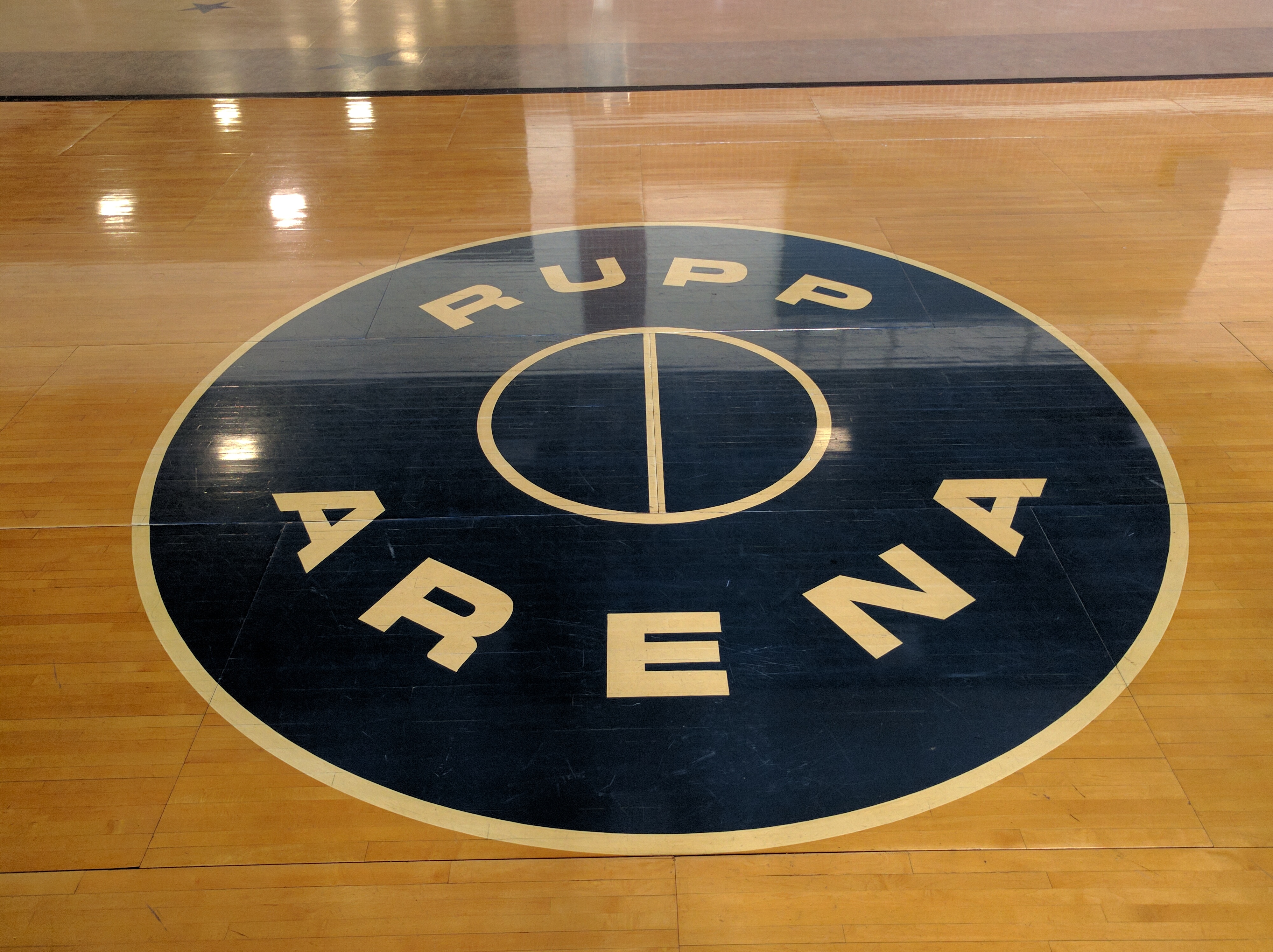
Re-thinking our new court
- Thread starter Wonky
- Start date

This at midcourt:
One baseline needs to have "Wildcats" I also like the bold font better:
This was a cool concept but it just didn't translate to TV. I like the absence of checkerboard and I like the Rupp/Central Bank logo. Everything else should be changed:
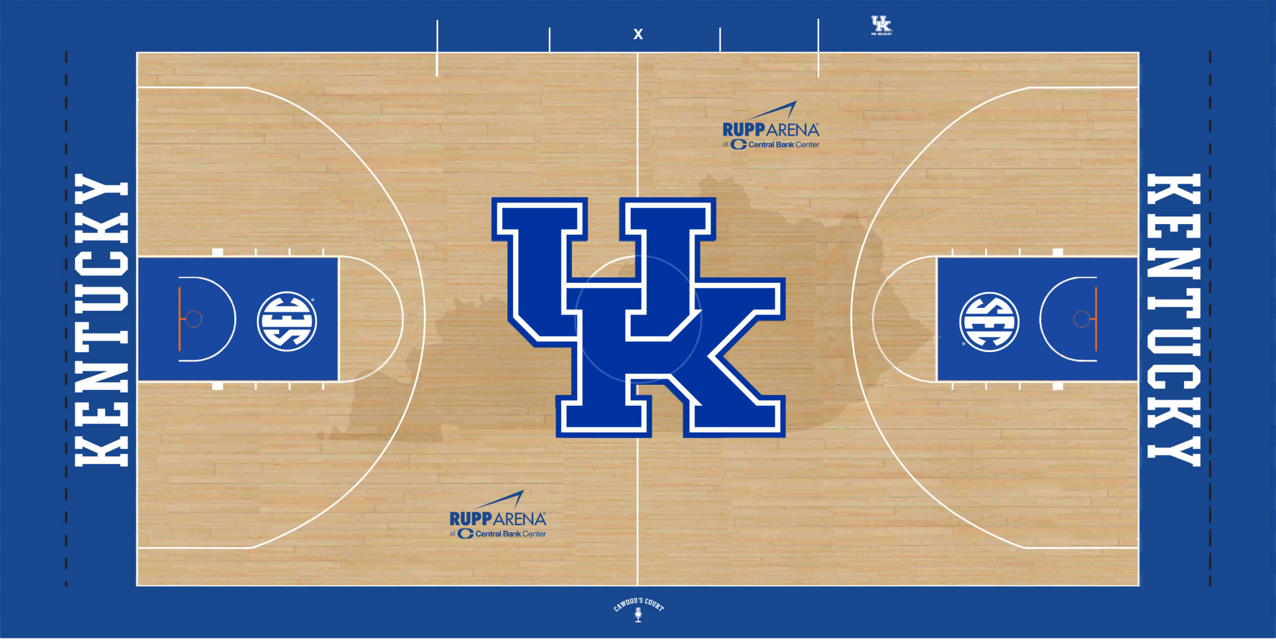
One baseline needs to have "Wildcats" I also like the bold font better:
This was a cool concept but it just didn't translate to TV. I like the absence of checkerboard and I like the Rupp/Central Bank logo. Everything else should be changed:

Gives me a headache. I know what they tried to do but it looks like a paint spillTalking about courts Oregon has got to be the ugliest
Beautiful. That's how our new court should have looked
I like them trees at Oregon.
No shit. I love that court. I also want our new logo at half court. Y’all would die if I got to pick this stuff out
No shit. I love that court. I also want our new logo at half court. Y’all would die if I got to pick this stuff out
Last edited:
I know your lieingI like them trees at Oregon. M
No shit. I love that court. I also want our new logo at half court. Y’all would die if I got to pick this stuff out
I know your lieing
*you're lying
I swear I’m not.I know your lieing
The weird shape of Kentucky makes it a bad state for such a large graphic. Wouldn’t be bad at half the size. Would also look classier that way. I do love mid-century so I agree with the idea at the top of the post. I also wish we’d go back to a deeper blue instead of the nearly electric blue that is used now.
We’ve never had a deeper blue. That was because jersey manufacturing was pretty piss poor as far as color shades went. Look at tennessee football in the 90s. Almost yellow.The weird shape of Kentucky makes it a bad state for such a large graphic. Wouldn’t be bad at half the size. Would also look classier that way. I do love mid-century so I agree with the idea at the top of the post. I also wish we’d go back to a deeper blue instead of the nearly electric blue that is used now.
Similar threads
- Replies
- 1
- Views
- 447
- Replies
- 23
- Views
- 912
- Replies
- 6
- Views
- 711
ADVERTISEMENT
ADVERTISEMENT