Title says it all. WTH do we have to do as a fan base to get the administration to hear us? Bring back the Power K!


Colleges
- AAC
- ACC
- Big 12
- Big East
- Big Ten
- Pac-12
- SEC
- Atlantic 10
- Conference USA
- Independents
- Junior College
- Mountain West
- Sun Belt
- MAC
- More
- Navy
- UAB
- Tulsa
- UTSA
- Charlotte
- Florida Atlantic
- Temple
- Rice
- East Carolina
- USF
- SMU
- North Texas
- Tulane
- Memphis
- Miami
- Louisville
- Virginia
- Syracuse
- Wake Forest
- Duke
- Boston College
- Virginia Tech
- Georgia Tech
- Pittsburgh
- North Carolina
- North Carolina State
- Clemson
- Florida State
- Cincinnati
- BYU
- Houston
- Iowa State
- Kansas State
- Kansas
- Texas
- Oklahoma State
- TCU
- Texas Tech
- Baylor
- Oklahoma
- UCF
- West Virginia
- Wisconsin
- Penn State
- Ohio State
- Purdue
- Minnesota
- Iowa
- Nebraska
- Illinois
- Indiana
- Rutgers
- Michigan State
- Maryland
- Michigan
- Northwestern
- Arizona State
- Oregon State
- UCLA
- Colorado
- Stanford
- Oregon
- Arizona
- California
- Washington
- USC
- Utah
- Washington State
- Texas A&M
- Auburn
- Mississippi State
- Kentucky
- South Carolina
- Arkansas
- Florida
- Missouri
- Ole Miss
- Alabama
- LSU
- Georgia
- Vanderbilt
- Tennessee
- Louisiana Tech
- New Mexico State
- Middle Tennessee
- Western Kentucky
- UTEP
- Florida International University
High School
- West
- Midwest
- Northeast
- Southeast
- Other
- Alaska
- Arizona
- California
- Colorado
- Nevada
- New Mexico
- Northern California
- Oregon
- Southern California Preps
- Washington
- Edgy Tim
- Indiana
- Kansas
- Nebraska
- Iowa
- Michigan
- Minnesota
- Missouri
- Oklahoma Varsity
- Texas Basketball
- Texas
- Wisconsin
- Delaware
- Maryland
- New Jersey Basketball
- New Jersey
- New York City Basketball
- Ohio
- Pennsylvania
- Greater Cincinnati
- Virginia
- West Virginia Preps
ADVERTISEMENT
Install the app
How to install the app on iOS
Follow along with the video below to see how to install our site as a web app on your home screen.
Note: This feature may not be available in some browsers.
You are using an out of date browser. It may not display this or other websites correctly.
You should upgrade or use an alternative browser.
You should upgrade or use an alternative browser.
Bring back the Power K
- Thread starter CB3UK
- Start date
I can honestly say this is one subject that I could care less about. Which one they use is fine with me.
Last edited:
Bill Curry's "Blackwatch K" was dope.
Too bad we were unwatchably horrible.
Too bad we were unwatchably horrible.
I would like to see a picture of it also. I think I know what you mean and if I am correct I tried to find a license plate of one for my new white SUV and could not find one. Do you mean a simple very bold blue K on white background? No U. If so I think it is a great look. Simple . Clean. Elegant.
I would like to see a picture of it also. I think I know what you mean and if I am correct I tried to find a license plate of one for my new white SUV and could not find one. Do you mean a simple very bold blue K on white background? No U. If so I think it is a great look. Simple . Clean. Elegant.
The Black Watch K is RMP's avatar. Curry put the black outline on the regular K that originated in the Curci era. We copied that from UT. They went to it in 73 and we stole it in 75.
Wildman, as bad as you hate the vols I don't know why you want us to go back to something we ripped off from them.

I do hate me some UT but and understand the K is from an era where we didn't have the most success. I think I just associate it with UK football because that's what we wore when I starting getting addicted to Kentucky football. I like the plain K better but it is a little too UTish. The black watch K added a little difference and had that true SEC look. I just think the interlocking UK looks too generic. It's good for the overall logo but I like a helmet logo that pops and the power K did. I really like the outline of the state with the Wildcat head but I think that should be reserved as a special helmet for throwback games.
The Power K is awesome. Kentucky should use it at least once a season. I'm thinking the UL game would be the perfect opportunity to bring back the Power K.
Anything but that new logo they are going to use in the center of the field, that thing is hideous.
I currently cannot find any reference but I do recall a discussion about the UK's use of the power K and one of the issues w
Says the man with an interlocking UK football helment for an avatar.Title says it all. WTH do we have to do as a fan base to get the administration to hear us? Bring back the Power K!
I always liked the State logo with the Cat head used by Fran Curci. That would look good at mid-field.
I currently cannot find any reference but I do recall a discussion about the UK's use of the power K and one of the issues w
You gonna leave us in suspense or what?
LOL...something I started writing yesterday and had something come up and never finished. I stopped to try and find some additional info and never got back to it. This new message board obviously saves your drafts.You gonna leave us in suspense or what?
I was going to say that I recall some discussion about one of the reasons for the change from the power K to the interlocking UK had to do with trademark issues. The trademark issues affected licensing agreements...which affects $$$.
Last edited:
lmao the irony wasn't lost on me when I first saw the post after submitting it.I currently cannot find any reference but I do recall a discussion about the UK's use of the power K and one of the issues w
Says the man with an interlocking UK football helment for an avatar.
yes, I forgot but seeing them all together, the years with the cat look best...we could use that logo on some new fandangled helmet...flat, or shiny...or flat black. would love to see us use a couple of throwbacks for big games.I always liked the State logo with the Cat head used by Fran Curci. That would look good at mid-field.
I prefer the block K. Curry was a horrible coach but the early 90's had the best uniforms and helmets. I loved his Scotch Guard theme. Curci's teams were nice also
Please no power K, please.
I know many of what I'll call our "more seasoned" fans love/miss the old days and our old ways of doing things, but I don't think most of the fanbase feels the same way.
It's called brand recognition. Completely changing the brand logo at this point would do nothing but hurt the program.
Also, if we were going to do anything with the logo it seems like we'd be clamoring about making the logo have MORE detail and characteristics, not simplify it by making it a single-letter block K.
The nation recognizes us as UK, not "K". If we're going to do anything let's bring back the old wildcat or add the outline of Kentucky. Those things would do a heck of a lot more for most fans than a plain block style K.
Last edited:
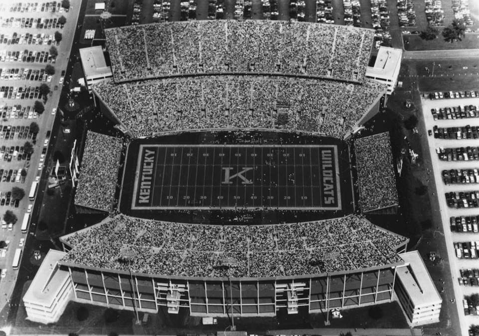
Love the font used in this pic. Also, probably in the minority, but I like having KENTUCKY in both EZs instead of WILDCATS.
Bring back the Curry K, sharp looking.
Bring back the Curry K, sharp looking.
I am in total agreement with you. Clean.Simple. Elegant. Love it.Love the font used in this pic. Also, probably in the minority, but I like having KENTUCKY in both EZs instead of WILDCATS.
Bring back the Curry K, sharp looking.
…...It's called brand recognition. Completely changing the brand logo at this point would do nothing but hurt the program.
The nation recognizes us as UK, not "K".
The nation recognizes University of Georgia as "UGA"….but they seem to "survive" with just the distinctive "G" on their helmets. University of Nebraska=N; University of Tennessee=T; University of Wisconsin=W; Stanford University=S; University of Arizona=A; and so on…..it works for universities who use a single letter on the helmet without the "U."
As far as "UK" for brand recognition, the power of the "UK" is overplayed IMO…..I spend a lot of time overseas, and when I wear the UK logo outside the US, I get almost universal recognition as representing the United Kingdom.
Either way, at a minimum….they should break out the Power K on white helmets for homecoming each year!
GBB!
I've Googled on UK stuff many a time only to get United Kingdom crap... The logo we have shows a lack of creativity and has since it was initiated...And the recent "new & improved" logo will go unnoticed by 99.9% of fans and 100% of those not .... Does it bother me?... No!... But if a person asks someone, who they for??? They'll most often say "Kentucky" and far less often "UK"... And I think this runs true in most places but I haven't done a study... What we forget sometimes is that these decisions are made by people the University employs that weren't from around these parts.... They are fans of Kentucky" because the check they get on Friday makes it so............ And I'm talking about you Barnfart.The nation recognizes University of Georgia as "UGA"….but they seem to "survive" with just the distinctive "G" on their helmets. University of Nebraska=N; University of Tennessee=T; University of Wisconsin=W; Stanford University=S; University of Arizona=A; and so on…..it works for universities who use a single letter on the helmet without the "U."
As far as "UK" for brand recognition, the power of the "UK" is overplayed IMO…..I spend a lot of time overseas, and when I wear the UK logo outside the US, I get almost universal recognition as representing the United Kingdom.
Either way, at a minimum….they should break out the Power K on white helmets for homecoming each year!
GBB!
I don't see what the problem is with just making it football exclusive if nothing else. The basketball team never work the Power K if I recall correctly. It seems that they always had the more vertical UK, if not even a cheap looking separated UK until they started with Nike's gimmick logo.


Nothing worse that a big giant letter in the middle of the field. I'd like something like LSU has at center field.
I always liked the State logo with the Cat head used by Fran Curci. That would look good at mid-field.
These are pretty sweet.
Close-up it looks good. From a distance on TV, I believe the old-style cat head would look like a wadded up ball of string on the side of the helmet. You need very clear, sharp and distinct logos for helmets.....that are discernable from a distance. Too much "art" detail in the old UK wildcat face for a helmet IMO.These are pretty sweet.
Similar threads
- Replies
- 5
- Views
- 554
- Replies
- 18
- Views
- 594
- Replies
- 0
- Views
- 107
- Replies
- 78
- Views
- 9K
ADVERTISEMENT
ADVERTISEMENT