

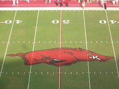
I know many of us had hoped that the super-small midfield-logo revealed in the conceptual drawing released a while back were only a rendering that weren't exactly to scale, but it turns out we were wrong. Here's the original design, with the ultra-small logo, that was released a month or so ago:

And here's how it looks in person:

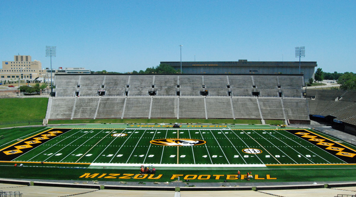
Overall, besides the logo, the field looks great. But if we could've just extended the mid-field logo from the 40-to-the-40 (or even just the 42 or 43 yard-line) instead of the super-small, barely visible one that we now have, the field would look almost twice as good. Something more in proportion to some of these:


I went over to the KSR to see if I was the only UK fan the noticed how surprisingly small the logo was, and here is the comments section that accompanies the post revealing the midfield logo:
11 responses to “The new UK logo has been installed at midfield”
It's more than a little telling to me, that basically every other person that comments is talking about the size of the logo....that shouldn't be the first thought that enters a casual fans' mind when they first view the new playing surface.
I mean, it's hard to pick out the negatives w/ the playing surface, because I really, really like the way it looks..I actually love every single thing about it, except for the midfield logo..the dark and light alternating shades of green..the subtle blue checkerboard end zones w/ Kentucky lettering..it all looks great, and gives us a unique look that we've been severely lacking..but I guess it's just frustrating because it would've been such an easy fix to put the cherry on top of the cake with a good-looking midfield logo...it's frustrating b/c the field was so close to being great instead of the, "Wow, that's a really good looking field..but if they just would've made the logo bigger..." that I've seen more times than I can count in the past few days.
Something like field appearance, uniforms, etc. probably seems insignificant to some..but most fans, coaches, players and recruits take a lot of pride in aesthetics, and it's a lot more important than many believe. It's a selling point for your program when a neutral person watches a game on TV and sees a good looking uniform and good looking field/stadium.
At the end of the day, it's not going to directly make a difference in whether we win or lose, but it's still important.
I know it's hard to complain when you've got an A- or an A, but it's a little frustrating when we were so close to an A+...especially when that A+ could've been achieved with zero extra effort involved.
And here's how it looks in person:
Overall, besides the logo, the field looks great. But if we could've just extended the mid-field logo from the 40-to-the-40 (or even just the 42 or 43 yard-line) instead of the super-small, barely visible one that we now have, the field would look almost twice as good. Something more in proportion to some of these:
I went over to the KSR to see if I was the only UK fan the noticed how surprisingly small the logo was, and here is the comments section that accompanies the post revealing the midfield logo:
11 responses to “The new UK logo has been installed at midfield”
CatsBy80 June 5, 2015 at 11:03 am | Permalink | Reply
it’s so small… I’m a little disappointed in that… that’s what she said (i couldn’t resist).
Kentucky33 June 5, 2015 at 11:07 am | Permalink | Reply
Should have ran it from the 40 to the other 40. Would look a lot better I think.
Blue_Cat75 June 5, 2015 at 11:10 am | Permalink | Reply
They need to fire the drunk that tried to put the “KENTUCKY” in the left end zone.
Samattox47 June 5, 2015 at 11:11 am | Permalink | Reply
I’m not really a fan of the new logo…guess it’ll have to grow on us. Don’t understand why it’s so small. Love the turf and the endzones. Can’t wait for the stadium to be packed with fans!
nybrasky June 5, 2015 at 11:15 am | Permalink | Reply
Love the strategy of confusing the opponent in the red zone on the left. Brilliant. Mitch is always one step ahead.
pcefrog5 June 5, 2015 at 11:19 am | Permalink | Reply
Would have been sweet if they could have made the turf look just like real Kentucky Bluegrass.
Tim Gray June 5, 2015 at 11:45 am | Permalink | Reply
I love it myself. and the new turf, especially with our quicker team now
Blackhawk June 5, 2015 at 11:54 am | Permalink | Reply
Great the put it in upside down. Heck the only ones to get anything right were the guys on the right side.
chrush June 5, 2015 at 12:50 pm | Permalink | Reply
Is there a reason WHY we have the smallest midfield logo in the SEC? It used to be MUCH bigger! LSU’s tiger head stretches from 40 to 40.
Kentucky D June 5, 2015 at 1:15 pm | Permalink | Reply
Question…Is the entire lower-level getting blue seat back, or just certain sections?
Team Pup N' Suds June 5, 2015 at 1:22 pm | Permalink | Reply
Not a big fan of the small logo, but overall, the new field looks great.


It's more than a little telling to me, that basically every other person that comments is talking about the size of the logo....that shouldn't be the first thought that enters a casual fans' mind when they first view the new playing surface.
I mean, it's hard to pick out the negatives w/ the playing surface, because I really, really like the way it looks..I actually love every single thing about it, except for the midfield logo..the dark and light alternating shades of green..the subtle blue checkerboard end zones w/ Kentucky lettering..it all looks great, and gives us a unique look that we've been severely lacking..but I guess it's just frustrating because it would've been such an easy fix to put the cherry on top of the cake with a good-looking midfield logo...it's frustrating b/c the field was so close to being great instead of the, "Wow, that's a really good looking field..but if they just would've made the logo bigger..." that I've seen more times than I can count in the past few days.
Something like field appearance, uniforms, etc. probably seems insignificant to some..but most fans, coaches, players and recruits take a lot of pride in aesthetics, and it's a lot more important than many believe. It's a selling point for your program when a neutral person watches a game on TV and sees a good looking uniform and good looking field/stadium.
At the end of the day, it's not going to directly make a difference in whether we win or lose, but it's still important.
I know it's hard to complain when you've got an A- or an A, but it's a little frustrating when we were so close to an A+...especially when that A+ could've been achieved with zero extra effort involved.
Last edited:

![[winking]](http://l.yimg.com/j/assets/img/emoticons/classic/wink.r191677.gif "Winking [winking]")
