ADVERTISEMENT

Who has the best look? Ranking SEC uniforms

We parked just off the Interstate in '07, walked maybe a mile uphill (slightly as I recall), and passed a lot of state-of-the-art athletic facilities, several named "Walton," . . . apparently there is a Walton family who did well in Arkansas. I walked away with the feeling UK needed to do some catching up in overall athletic facilities, and we have largely done so. And somewhat like the "strip" of facilities up that hill, we have used land near our stadium and concentrated some of the facilities a bit more than they once were.

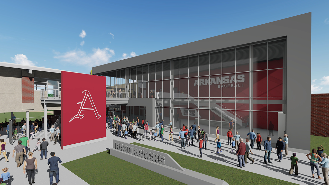
Alice Walton does a lot for arts and entertainment in the area and pumps money into that but the Waltons themselves don't really give as much for athletics as people might think. However former Walmart execs are partially responsible for funding our new $27M baseball training facility pictured below and Jerry Jones gives a lot for our football facilities. It's crazy the arms race that keeping up with facilities has become in the SEC. It's allowed teams traditionally near the bottom of the conference to recruit better and leveled out the playing field, creating more parity. We just did a nice renovation/expansion of our north endzone two years ago and some teams have already passed us up since it seems like. Even as nice as I feel they are nationally, our football facilities are still probably just average to above average for the SEC and Bud Walton Arena for basketball is due for a facelift soon too.

I think having "Walmart.com" on our football stadium is pretty tacky but I guess if they pay enough to have it there then we gotta put whatever they want.

Web_BSB-Render1.png
 
Orange isn't bad, but UT orange is awful, it looks washed out, like someone put too much Clorox in the wash, or the get their uniforms from Clemson when they start to fade. I like AU's uniforms better than LSU, I just think it's a neat clean look. I like UK's all blue with chrome helmet blue mask. I think it hurts UK having so many different looks instead of home and away., but UK and the fans like it, the rest doesn't matter.
I'm a big fan of the Dogs look with the red and gray and G logo. Agree on the UT thing. Way back when i used to like the orange look because it was so different but I also think it looks faded now and needs the grey or black or something added to it to make it tolerable.

And I cant like any uniform that is just maroon, forest green, or navy blue. Just drab as can be. Bama pulls it off only because of its history and iconic look.
 
Yeah, agreed. I think most would say the “classic” SEC uniforms — Alabama, LSU, Florida, Auburn, Tennessee, Georgia, Ole Miss — stand above in some order, but all subjective.

Of the new school ones, I love Vanderbilt’s with the naval iconography.

I’d put ours last because I think they’re pretty awful, but that horse is dead. We’re doomed to walk the earth in checkerboards ... and no Power K.
Add faded blue to the mix and you get a pretty bland combination of Big Blue FB uniforms. Blueberries are the worst in P5 FB. Prefer the traditional darker UK blue and power K on white helmets. GBB!
 
LSU has broken out the purple unis from time to time. But they are seen as having a stench of "bad luck".....much like the Cowboys refusing to wear blue.

Can remember back in the late 90s / early 00"s we made LSU wear the purples here....and they lost.

DiNardo was furious and played into the mythology by in part blaming the uniforms.
Dinardo, wth, he was bad everywhere. How he kept getting jobs is a mystery
 
The only thing on this subject that I’ll concede to is that ole miss old style helmets are kinda cool
 
I'm a big fan of the Dogs look with the red and gray and G logo. Agree on the UT thing. Way back when i used to like the orange look because it was so different but I also think it looks faded now and needs the grey or black or something added to it to make it tolerable.

And I cant like any uniform that is just maroon, forest green, or navy blue. Just drab as can be. Bama pulls it off only because of its history and iconic look.

Yeah those are just colors I don't care for on anything, just look drab or something. I am a big fan of blue, that chrome helmet, blue mask and logo with blue Jersey UK wears is pretty sharp imo. I don't care which pants they wear with it and imo is the best UK look, but I know some will like others better.
 
Anytime you just have two colors - blue and white - there is only so much you can do football wise.
 
I ranked Arkansas pretty low, but on my one trip to Fayetteville, I was amazed by the Hog stuff on shirts, bumper stickers, caps, etc. The Hog jumping through the “A”, etc., etc.

Left me with hog envy, and I farm cattle!!

I love Arkansas’ full embrace of being a relatively rural, land-grant Southern school! You can’t get anymore redneck than calling the Hogs!!

NEVER and I mean NEVER use Arkansas and redneck in the same sentence!!!
Don’t you watch Ozark???
 
I think it’s $20 million for over 12 years

That’s true. I was thinking of the totality of the JMI deal of which Kroger Field is a part. As I read the details, JMI gets the money from Kroger, and any other naming partners (not including Rupp, obviously, as UK doesn’t own it) and JMI is paying UK.

“The multimedia rights agreement pays UK Athletics $210 million over 15 years, including a signing bonus of $29.4 million built in to help fund important capital projects like the baseball stadium currently under construction.”
 
  • Like
Reactions: Pelosigalore
ADVERTISEMENT