ADVERTISEMENT

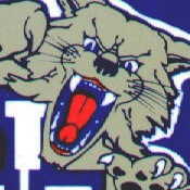
bring back the “UK” logo and the leaping wildcat

RunninRichie

All-American
Sep 5, 2019
24,615
59,242
113
Matt Jones said Mitch told him after next season the checkerboard is gone, well, why not bring back the UK logo as well?

DvC4YgbU0AEHFxv.jpg

And while we’re at it, bring back the leaping wildcat. UL brought back their old retro logo, that is awesome (oh my god) in the dunking cardinal. Why can’t UK bring this back and modernize it with the old power K logo? In place of the old 1990 “UK”
MgCJKTuomqNUYex-1600x900-noPad.jpg
 
Not good enough. I'd burn the checkerboard jerseys now. They have stench of worst season ever on them and rather see UK play in practice jerseys than watch them wear those. I am not big on uniform changes, but no way do you run it back wearing that crap after last year. Burn them in a sacrifice to the hoops gods to apologize for '21 season. Tell Nike/NCAA they have covid--do whatever it takes to wear anything different.
 
Matt Jones said Mitch told him after next season the checkerboard is gone, well, why not bring back the UK logo as well?

DvC4YgbU0AEHFxv.jpg

And while we’re at it, bring back the leaping wildcat. UL brought back their old retro logo, that is awesome (oh my god) in the dunking cardinal. Why can’t UK bring this back and modernize it with the old power K logo? In place of the old 1990 “UK”
MgCJKTuomqNUYex-1600x900-noPad.jpg
Agree with all of this and it can't happen soon enough!
It's like we let a bunch of community college art students loose with our logos and branding.
 
Matt Jones said Mitch told him after next season the checkerboard is gone, well, why not bring back the UK logo as well?

DvC4YgbU0AEHFxv.jpg

And while we’re at it, bring back the leaping wildcat. UL brought back their old retro logo, that is awesome (oh my god) in the dunking cardinal. Why can’t UK bring this back and modernize it with the old power K logo? In place of the old 1990 “UK”
MgCJKTuomqNUYex-1600x900-noPad.jpg
 
This really does blow my mind. I love the new logo. It’s badass. I truly believe that the new logo (the one with the birds) is the best in all college sports. I just really like it. It just appeals to me. I thinks it’s slick and aggressive. I don’t buy UK gear that doesn’t have it. Seems I’m in the minority. Oh well, we like what we like
 
This really does blow my mind. I love the new logo. It’s badass. I truly believe that the new logo (the one with the birds) is the best in all college sports. I just really like it. It just appeals to me. I thinks it’s slick and aggressive. I don’t buy UK gear that doesn’t have it. Seems I’m in the minority. Oh well, we like what we like
Sorry Mitch, we just don't like it.
 
This really does blow my mind. I love the new logo. It’s badass. I truly believe that the new logo (the one with the birds) is the best in all college sports. I just really like it. It just appeals to me. I thinks it’s slick and aggressive. I don’t buy UK gear that doesn’t have it. Seems I’m in the minority. Oh well, we like what we like
Can anyone bring the logo with birds up? I don't think I've ever seen it..,
 
This really does blow my mind. I love the new logo. It’s badass. I truly believe that the new logo (the one with the birds) is the best in all college sports. I just really like it. It just appeals to me. I thinks it’s slick and aggressive. I don’t buy UK gear that doesn’t have it. Seems I’m in the minority. Oh well, we like what we like
I really like it too. I like the new K too, I like the checkerboards... yeah, the absolute opposite of almost everyone I see on here. I think the new looks are clean and fit in with modern stylings.
 
Matt Jones said Mitch told him after next season the checkerboard is gone, well, why not bring back the UK logo as well?

DvC4YgbU0AEHFxv.jpg

And while we’re at it, bring back the leaping wildcat. UL brought back their old retro logo, that is awesome (oh my god) in the dunking cardinal. Why can’t UK bring this back and modernize it with the old power K logo? In place of the old 1990 “UK”
MgCJKTuomqNUYex-1600x900-noPad.jpg
The new logo and the checkerboard are bad luck.
 
This really does blow my mind. I love the new logo. It’s badass. I truly believe that the new logo (the one with the birds) is the best in all college sports. I just really like it. It just appeals to me. I thinks it’s slick and aggressive. I don’t buy UK gear that doesn’t have it. Seems I’m in the minority. Oh well, we like what we like
yK4Q15f.png
 
I really like it too. I like the new K too, I like the checkerboards... yeah, the absolute opposite of almost everyone I see on here. I think the new looks are clean and fit in with modern stylings.
the POWER K never needed to be “modernized” does tennessee’s T need to be modernized by some beanie wearing, douche beard, hipster? No. It’s timeless and iconic.
 
Matt Jones said Mitch told him after next season the checkerboard is gone, well, why not bring back the UK logo as well?

DvC4YgbU0AEHFxv.jpg

And while we’re at it, bring back the leaping wildcat. UL brought back their old retro logo, that is awesome (oh my god) in the dunking cardinal. Why can’t UK bring this back and modernize it with the old power K logo? In place of the old 1990 “UK”
MgCJKTuomqNUYex-1600x900-noPad.jpg
Agree 100% and being back the 2003 style uniforms. Some of the best ones ever.
 
  • Like
Reactions: RunninRichie
ADVERTISEMENT
ADVERTISEMENT