
UK annouced that the midfield logo will be the same as the new logo on the Memorial Coliseum floor.
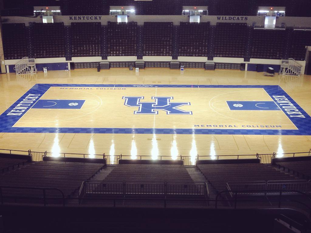
The #BBN is amazing. We wanted to wait to show off our new UK logo, but nothing gets past you. UK is making $1.7B of improvements across campus, including #TheNewCWS, football training facility and @UKHoopCats court with the new logo. For now, UK teams & fans will wear the same UK mark they have since ’97, but our new playing surfaces will be all about the future.
The #BBN is amazing. We wanted to wait to show off our new UK logo, but nothing gets past you. UK is making $1.7B of improvements across campus, including #TheNewCWS, football training facility and @UKHoopCats court with the new logo. For now, UK teams & fans will wear the same UK mark they have since ’97, but our new playing surfaces will be all about the future.